
Welcome to the P+S brand.
But before we get into the details…
There's a question worth asking before any details about logos, colours, fonts or guidelines.
Why does any of this matter?
It's a fair question. Brand guidelines can feel like rules for their own sake. A long list of dos and don'ts, filed somewhere, then ignored. We've all seen it. This isn't that.
What follows is something more interesting. It's an answer to a critical question: what do we want people to feel when they encounter Proctor + Stevenson?
Not what do we want them to think.
What do we want them to feel?
Because that's how brand actually works. Not through logos, or the right colours or font (even though all of those things matter). Brand works through the accumulation of impressions. Every email. Every pitch. Every conversation at an event. Every social post. Every piece of work we put our name on.
The agencies that win, the ones that grow, earn loyalty, get recommended in rooms when they’re not present, are the ones that understand this. They don't leave those impressions to chance. They're deliberate about the feeling they create. Consistent about it. Relentless, even.
How is our brand different?
Here's what we know about the B2B agency market: it's crowded, it's noisy and most of it sounds the same.
Bold claims everywhere. Strategic thinking. Creative excellence. Data-driven everything. Passionate teams. Proven results. The language has been used so many times it's stopped meaning anything.
In all of that noise, a differentiated brand isn't a nice-to-have. It's the only way to be heard. It can’t be different for the sake of it. It has to be different because it's true. Different because it reflects something real about who we are and how we work. Different in a way that makes the right people feel something when they see our name.
That feeling is the thing. It's what makes a prospective client pick up the phone. It's what makes an existing client recommend us without being asked. It's what makes a talented person choose us over somewhere that pays a bit more.
That's what a great brand does. It creates trust before a single conversation has taken place. It makes the yes easier to say.
The choices in these guidelines aren't arbitrary. The way we use colour, the way we write, the way we present our work: all of it has been thought about with one goal in mind. To make people feel exactly the right thing about Proctor + Stevenson.
Which means these guidelines aren't really rules at all.
They're how we make sure every part of our business sounds and looks like the best version of ourselves.

Proposition
Proctor + Stevenson helps ambitious B2B organisations solve their marketing challenges, uncover opportunities and achieve measurable commercial success.
Positioning
We find the yes in every marketing challenge.
Not the easy yes. Not the theoretical yes.
The yes that works in the real world, with real constraints.
The yes that comes from being independent and bold.
The yes that stands up to scrutiny and delivers measurable outcomes.
Most marketing challenges don’t arrive neatly packaged.
They arrive wrapped-up in competing internal priorities, legacy systems, compliance constraints, tight budgets, board-level scrutiny and more.
That’s when many agencies narrow the brief, stick to their specialism, or explain why something can’t be done.
We’re different. Proctor + Stevenson finds the yes.
Not the easy yes or the theoretical yes, but the yes that works in the real world.
We listen and understand, then join the dots and cut through the complexity to take responsibility for the outcome.
From brand and creative to strategy and tech, we’ve been doing this for nearly 50 years, building multi-decade relationships with clients who trust us with their most complex marketing challenges. You don’t earn that by playing it safe. You do it by being independent, bold and prepared to push for better, stronger, more successful answers.
When the stakes are high and the way forward isn’t obvious, we’re the partner who makes sure progress is possible AND measurable.
What we believe in

Our brand behaviours


#f5b40c
R:245 G:180 B:12
#000000
R:0 G:0 B:0
#ffffff
R:255 G:255 B:255
#282828
R:40 G:40 B:40
#31373c
R:49 G:55 B:60
#989898
R:152 G:152 B:152
#e3e3e3
R:277 G:277 B:277
Aa Bb Cc Dd Ee Ff Gg Hh Ii Jj Kk Ll Mm Nn Oo Pp Qq Rr Ss Tt Uu Vv Ww Xx Yy Zz
Aa Bb Cc Dd Ee Ff Gg Hh Ii Jj Kk Ll Mm Nn Oo Pp Qq Rr Ss Tt Uu Vv Ww Xx Yy Zz
Aa Bb Cc Dd Ee Ff Gg Hh Ii Jj Kk Ll Mm Nn Oo Pp Qq Rr Ss Tt Uu Vv Ww Xx Yy Zz
Aa Bb Cc Dd Ee Ff Gg Hh Ii Jj Kk Ll Mm Nn Oo Pp Qq Rr Ss Tt Uu Vv Ww Xx Yy Zz
Aa Bb Cc Dd Ee Ff Gg Hh Ii Jj Kk Ll Mm Nn Oo Pp Qq Rr Ss Tt Uu Vv Ww Xx Yy Zz
Aa Bb Cc Dd Ee Ff Gg Hh Ii Jj Kk Ll Mm Nn Oo Pp Qq Rr Ss Tt Uu Vv Ww Xx Yy Zz
Aa Bb Cc Dd Ee Ff Gg Hh Ii Jj Kk Ll Mm Nn Oo Pp Qq Rr Ss Tt Uu Vv Ww Xx Yy Zz
Aa Bb Cc Dd Ee Ff Gg Hh Ii Jj Kk Ll Mm Nn Oo Pp Qq Rr Ss Tt Uu Vv Ww Xx Yy Zz
Aa Bb Cc Dd Ee Ff Gg Hh Ii Jj Kk Ll Mm Nn Oo Pp Qq Rr Ss Tt Uu Vv Ww Xx Yy Zz
Aa Bb Cc Dd Ee Ff Gg Hh Ii Jj Kk Ll Mm Nn Oo Pp Qq Rr Ss Tt Uu Vv Ww Xx Yy Zz
Aa Bb Cc Dd Ee Ff Gg Hh Ii Jj Kk Ll Mm Nn Oo Pp Qq Rr Ss Tt Uu Vv Ww Xx Yy Zz
Font size: 3.75rem
Line height: 1.2
The wizard quickly jinxed the gnomes before they vaporized.
Font size: 2.3rem
Line height: 1.25
The wizard quickly jinxed the gnomes before they vaporized.
Font size: 2.25rem
Line height: 1.3
The wizard quickly jinxed the gnomes before they vaporized.
Font size: 2rem
Line height: 1.375
The wizard quickly jinxed the gnomes before they vaporized.
Font size: 1.625rem
Line height: 1.38
The wizard quickly jinxed the gnomes before they vaporized.
Font size: 1.25em
Line height: 1.4
The wizard quickly jinxed the gnomes before they vaporized.
1.125em / 16px
Line height: 1.6
The wizard quickly jinxed the gnomes before they vaporized.


- Bullet point item
- Bullet point item 2
- Bullet point item 3
- Bullet point item
- Bullet point item 2
- Bullet point item 3
Our tone is friendly. Upbeat. Honest. Knowledgeable.
We have a sense of humour, but we're not constantly trying to make you laugh. We're courageous and opinionated, but not shocking. We write the way we speak (without the swearing).
We use short, active sentences. Clear ideas. No filler. We keep things crisp and direct, wherever we can, and we trust our readers to be smart.
What 'finding the yes' sounds like
Our positioning shapes our tone in a specific way. When you write as P+S, you're writing as an agency that takes responsibility, finds solutions and says ‘yes’ more than ‘no’. That means:
- Lead with what's possible, not what's difficult.
- Be specific. Specific confidence is compelling.
- Make a difference. Clients don't pay us to be neutral: they pay us to be valuable, challenging, bold and creative.
- Keep it human. We're a company full of curious, clever people. Sound like one.
Friendly
We're warm and approachable. We treat people like people, not like targets or stakeholders. This doesn't mean we're casual about quality. It means we don't hide behind formality.
Upbeat
We're genuinely enthusiastic about the work. Not in an over-the-top, emoji-heavy way: in the way of people who actually care about finding the right answer. Energy is good.
Honest
We say what we think. If something isn't working, we say so. If a brief needs challenging, we challenge it. Honesty is what makes a long relationship possible – and we're in the business of long relationships.
Knowledgeable
We know our stuff. We've earned the right to have opinions. When we write about B2B marketing, technology or commercial strategy, we do it with authority, not arrogance.
How we write
We write the way we speak. That means:
Short sentences. One idea at a time.
Active voice. 'We solved the problem' not 'the problem was solved'.
Plain words. If a simpler word exists, use it.
No unnecessary adjectives. Let the nouns and verbs do the work.
Read it out loud. If it sounds odd, rewrite it.
There are times when technical terms are needed – they're specific in meaning and our clients understand them. Use them when they earn their place. When they don't, ditch them.
Words we like
Our favourite words are clear and specific. They're confident and occasionally a little unexpected. We like words that show we mean it.
Share. Discover. Solve. Build. Prove. Find.
Challenge. Outcome. Responsibility. Progress.
Don't be lazy. Don't say very or really. If you mean it, say it properly. Say it like you mean it. Because we do.
We also like the occasional unexpected word. The one that makes you pause, smile and keep reading. Not flippant. Not childish. Just a little playful. There's a difference.
Words we don't like
Buzzword bingo. Corporate jargon. Life's so much easier when we say what we mean.
If you wouldn't say it to a client's face across a table, don't write it. Why? It's confusing. And it makes us sound like everyone else, which is exactly what 'we find the yes' isn’t.
Synergy. Agnostic. Dialogue. Engagement.
Cutting edge. Transformative. Best-in-class. World-class. Passionate.
Reach out. Offline. Low-hanging fruit. Moving forward. Circle back.
A note on humour
We have a sense of humour. It's part of being human, and we're a company full of humans who enjoy what they do.
But we're not in the business of trying to be funny. When humour appears in our writing, it should feel natural. A dry observation. A self-aware aside. Something that makes someone smile without making them wince. If in doubt, leave it out.
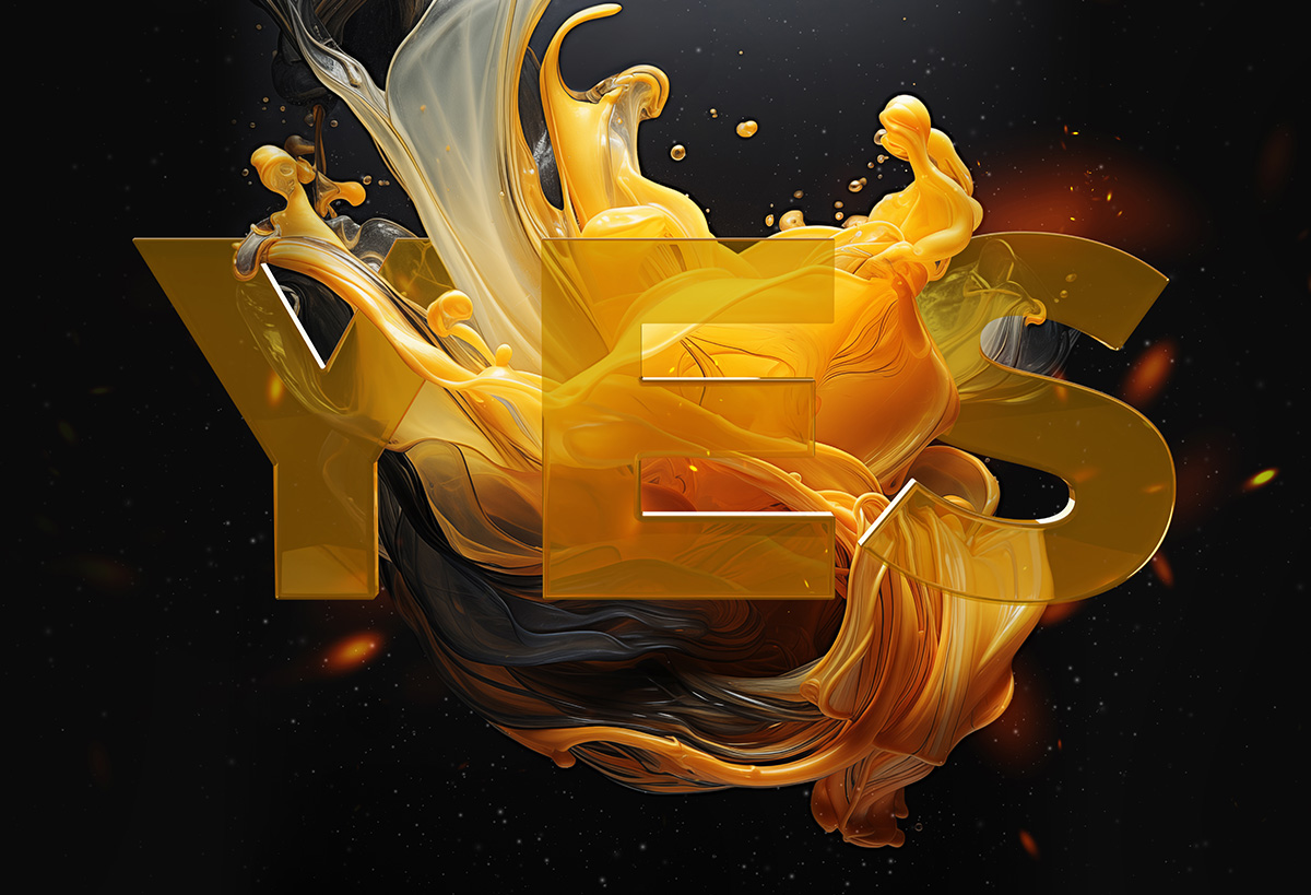
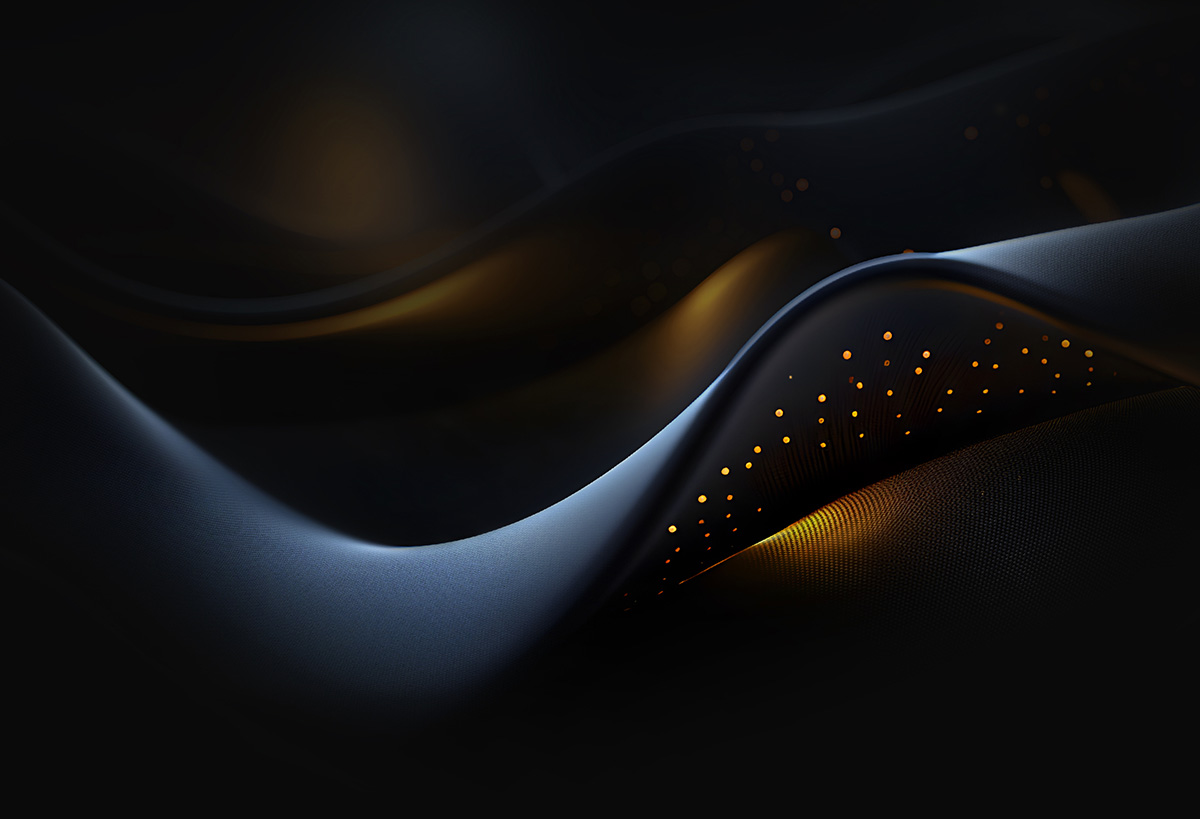


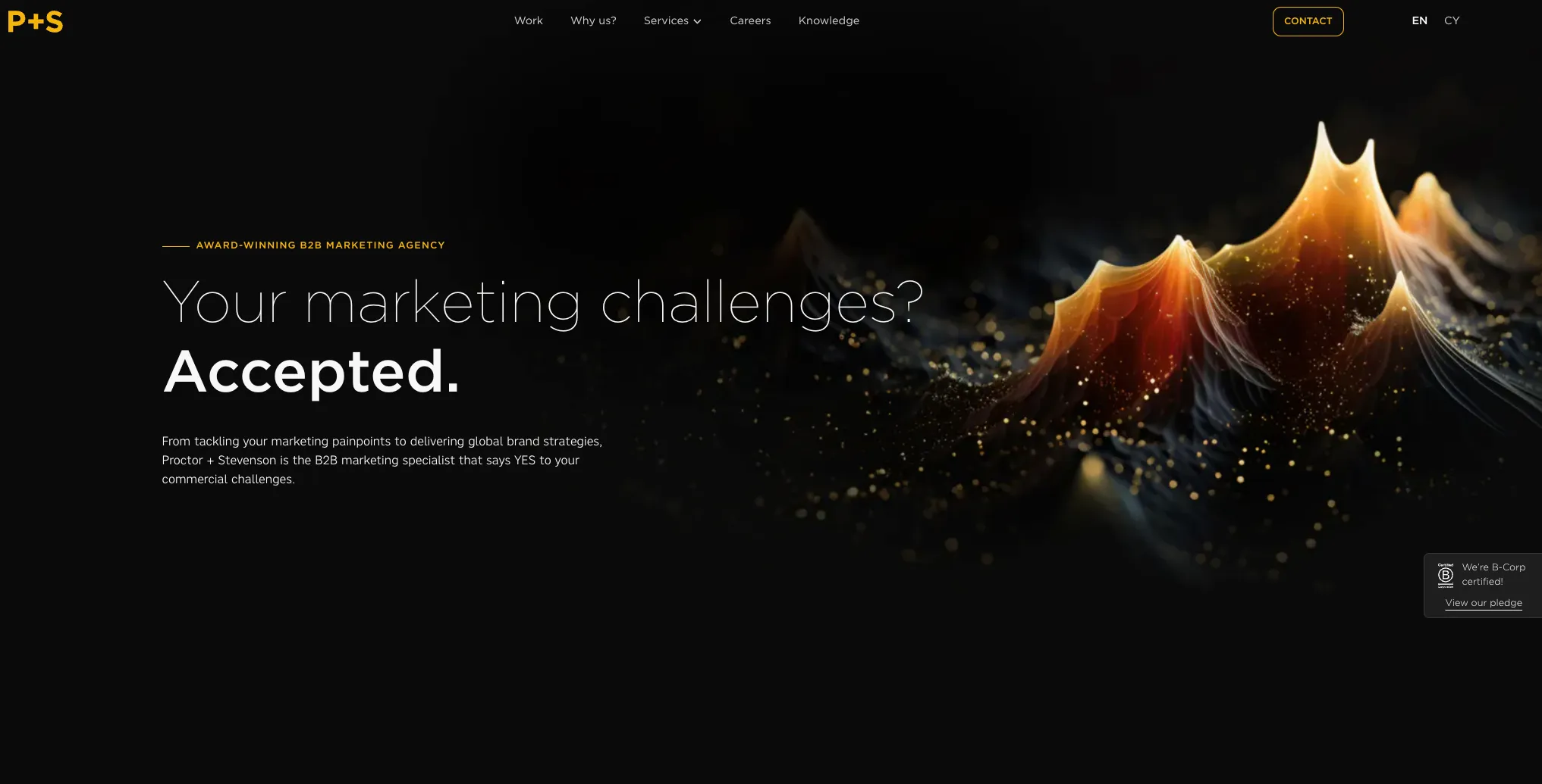
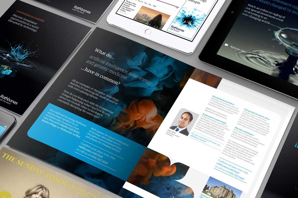
Our imagery has been created to give the brand an instantly recognisable visual presence across every touchpoint.
Using a combination of art direction, design skill, digital craft and AI-assisted image creation, we’ve developed a distinctive style built around abstraction, atmosphere and beautiful creativity. Often, they aren’t literal illustrations or conventional photography treatments. They’re visual expressions of the brand itself.
The imagery is designed to feel bold, immersive and unmistakably ownable. Organic forms, flowing structures and layered compositions work together to create a visual language that’s modern and emotionally engaging.
Think of them as being idents for a broadcasting company – they top and tail programmes throughout the day reminding people who they are watching. The individual programs may all vary but the visual glue that sticks it all together remains constant.
Consistency is essential to building long-term recognition. Our imagery should always feel part of the same visual family. While individual executions may vary in layout, colour, movement or meaning, the underlying feeling should remain constant.
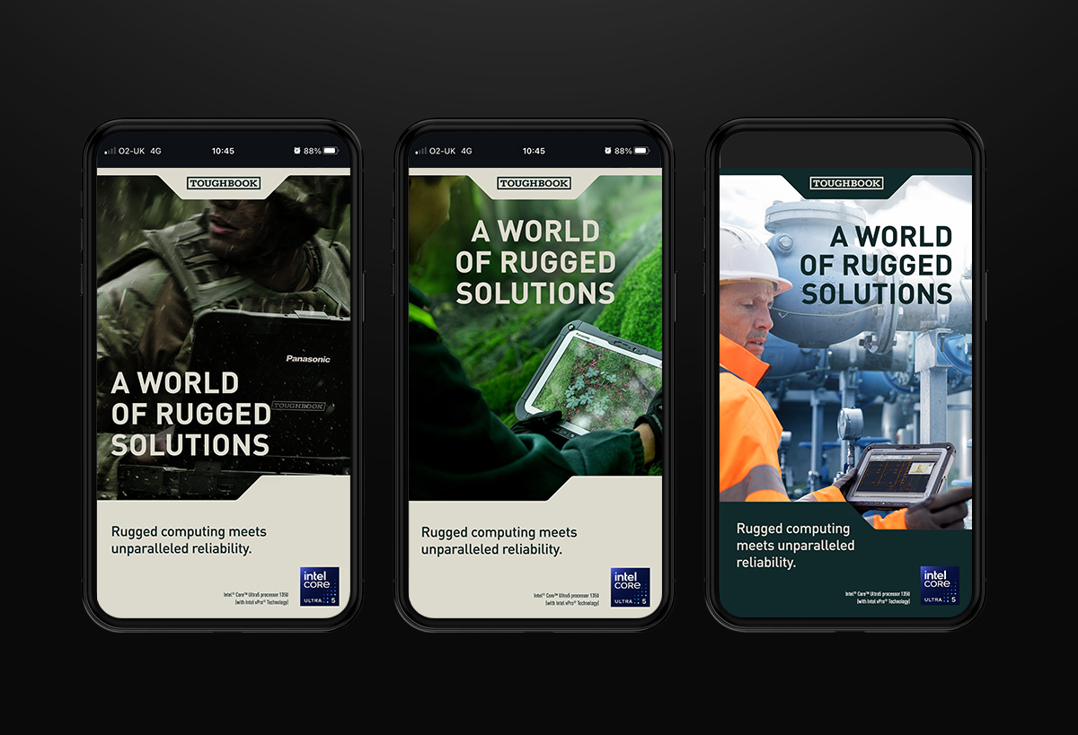
Avoid literal scene-setting, overly realistic photography treatments or generic stock-style visuals. Instead, focus on abstraction, shape, texture, light and composition. Detail, rhythm and form should take priority over direct representation.
The result should feel crafted rather than decorative. It should be visually striking without becoming chaotic, and expressive without losing clarity.






Illustration
It’s not all 3D renders!
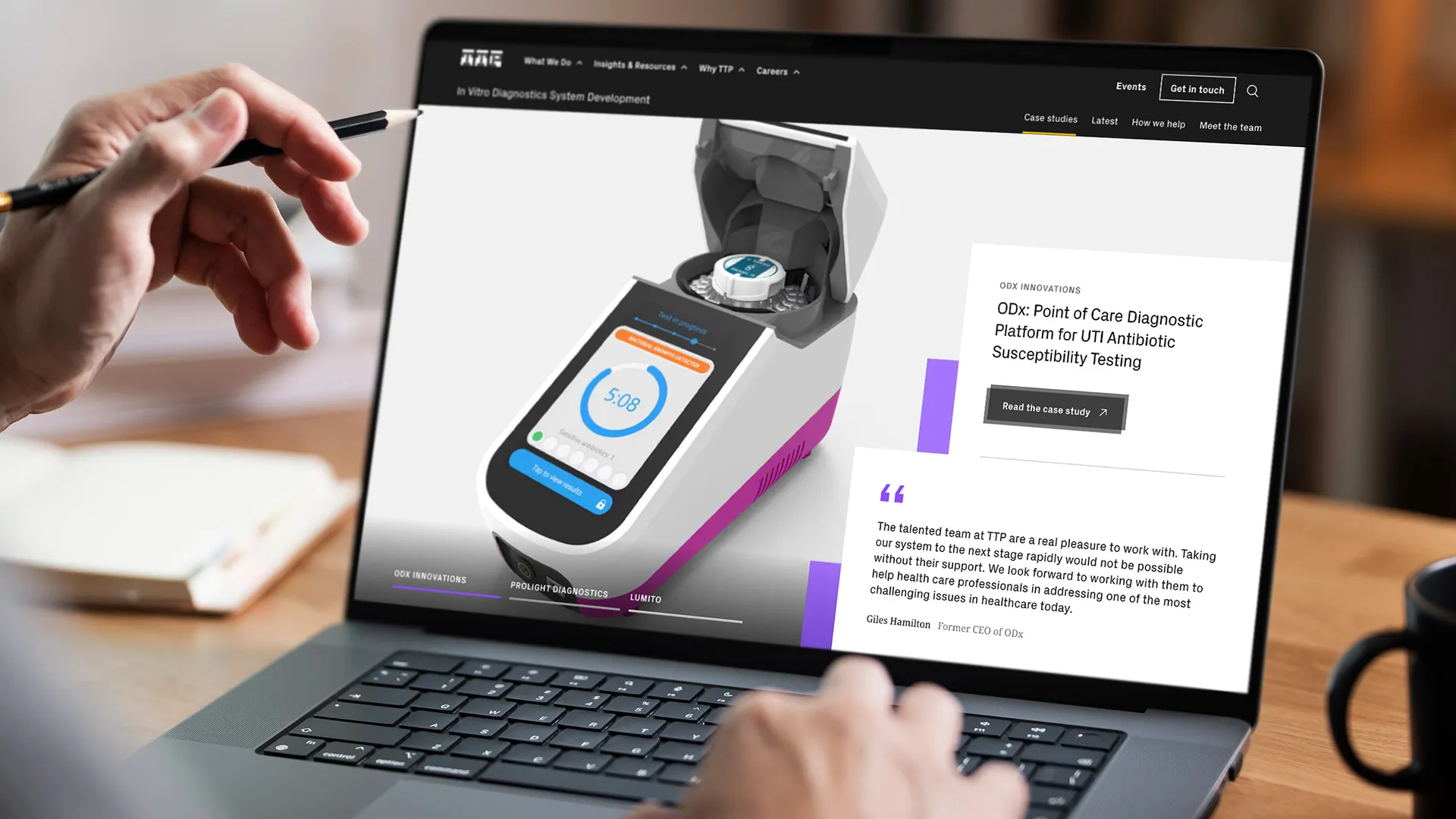
We are a creative company. We express ourselves in many ways – in fact in any way possible to get the job done.
What makes a Proctors illustration?
There is no set style, there is no set method. It can be hand drawn, vector processed, or 3D rendered. Use our corporate colours to bind our illustrative work together – make a family.





iStock is easy, that’s why everyone uses it. But we’re not just everyone.
OK use it if you have to, maybe it will save time, but don’t use it out of the tin, make it ours, modify it, use it as a component for something greater.
Motion Principles
Heartbeat
Giving life to our plus sign, using it to boost, turbo charge or as a transitionary device reinforces our overall ‘more power’ proposition. This should always be quick with the screen never lingering on a solitary plus sign without being resolved with P+S as per the intro/outro animations.
Easing
We use two main easing curves; high energy intro and eased intro/outro to achieve consistent motion throughout our communications. High energy intro for a ‘pop in’ movement with with gradual deceleration to the finish, and eased intro/outro for a stylised high velocity middle that’s eased in and out.
Pacing
We need to ensure we maintain consistency and never fatigue the viewer when animating elements in and out. Intro animation duration should remain short, sharp and never lacklustre.
Rhythm
We need to ensure we maintain consistency and never fatigue the viewer when animating elements in and out. Intro animation duration should remain short, sharp and never lacklustre.
Typography Motion
Typography
Our typography is how we speak, graphically. We have to ensure our tone of voice is delivered by communicating clearly, without distraction or showing off. We’ve set a few ground rules to achieve this.
Short headings
Short headings or statements should use word by word animation, keeping the movement minimal and sharp.
Long headings
Longer statements or blocks of text should use line by line animation to reduce visual load and keep it to the point.
Impact headings
Impactful short headings can use more impactful text animation with a flash of brand colour
Text blocks
To keep text legible on footage or photography, we suggest using animated block backgrounds. Consider colour and composition when paired with the image/footage.
Motion Identity
Sonic identity
Our sonic identity is compromised of a heartbeat at the most simplest form, combined with a light and identifiable musical motif that compliments the heartbeat.
Quick intro outro
This is a super quick 1 second animation intended for social media where getting to the content as quickly as possible is paramount. The plus attracts the P+S, simple.Available with a black or yellow background, to be inserted as a hard cut from the end of the video content.
Statement outro
With this outro we’ve got a short animation that weaves in our proposition. This outro would suit a case study video or where we’ve been talking about our services.The text is editable so the spin through of services/business functions etc. can be adapted to fit, but the ending should always remain as business.
Burst outro
This outro features a super quick burst of imagery to reflect the breadth and quality of work output from P+S. The imagery in this example is our brand work and would fit most applications, however it is adaptable and can use imagery of digital design for example - this would need to be approved by the video team.
Motion Graphics
Conceptual imagery
We have a suite of generated imagery and various suggestions for prompts to generate similar imagery to use only where appropriate.Mixing up generated imagery with typography, subtle fx and editing makes the sequences visually engaging.
Icon full set
Our iconography is a key element, representing our services and approach for usage on our digital interfaces. We have an initial set to use (ideally as lotties / animated svg for web) that are animated to loop, with an inital base state that is recognisbile and fully formed.
Motion Essentials
Transitions
We have a set of transitions to use, to be used sparingly when needing to divide up content where a hard cut just doesn’t ‘cut it’. These move either upward or ‘forward’ (left to right) to symbolise growth / progression.
Lower Third
Our lower third is to be used on interview style footage. Always left aligned, and placed within the video safe zones of the intended platform.
Subtitles
Where subtitles are required, we should ensure they are simple and legible, in the medium weight of Gothic, low on the frame and with a slight gradient behind for legibility against light backgrounds.
Title screen
When title or question screens are required, creative use of the animated backgrounds combined with coloured shapesand blending modes can be used to create distinctive graphics. Legibility is crucial when creating these.
Motion UI/UX
Responsive
Motion should be responsive to your users interaction. An energetic and accurate movement, caused by a click, scroll or hover. Never stagger or slow the movement of an element, visitors should never have to wait for an animation to finish.
Natural
Motion should be Inspired by real world forces, taking physics into consideration. Use easing in an apporopriate manner to achieve a realistic feel. Unnatural, linear movements can look out of place, or robotic.
Aware
Motion should be aware of the user, and the other website elements surrounding it and should be choreographed accordingly. Elements should never move in different directions, or cross paths, causing a jarring feel.
Intentional
Motion should be intentional. All movements should direct the user to the right place at the right time. Drawing attention to other elements can distract the viewer, and pull them off course.
Marketing
Now we have all of the elements of the Proctor + Stevenson brand laid out, it’s time to see how this is put into action across our marketing activities
It’s important to always consider that any materials we put out as a business reflect on us and can be seen by anyone from existing clients and partners to prospects and leads.
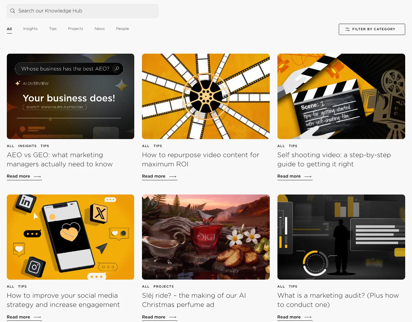
Ensuring we’re representing the brand in the best and most accurate way is crucial, and consistency is key. Below you can find some of the specs of applying the above work, and some imagery to put it into context.
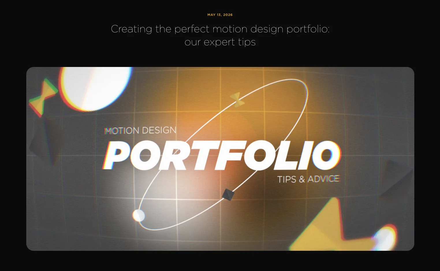
Blogs
- Aim to release a new blog every 1-2 months minimum
- Use a variety of text formats throughout each article e.g. lists, quotes and links
- Always link directly to sources of information and always try to include internal links where possible
- For image specs:
- Main header image: 1920 x 1080px
- Thumbail image: 722 x 542px
- Social media asset/mp4: 1080 x 1350px
- LinkedIn .gif: 1080 x 1920px
Social media
- We post a minimum of once per day Monday - Friday
- We post on LinkedIn, Instagram, YouTube and Facebook
- Static asset dimensions:
- LinkedIn / Facebook
- 1080 x 1350px as standard
- 1080 x 1080px for square images
- 1080 x 1920px for landscape images
- 1080 x 1350px as standard and to avoid cropping
- Video asset dimensions (across all platforms)
- Portrait: 1080 x 1920px (e.g. YouTube Shorts)
- Landscape: 1920 x 1080px (e.g. webinars or showreels)
- In-feed: 1080 x 1350px (i.e. hiring posts, calendar events and blog animations)
.webp)