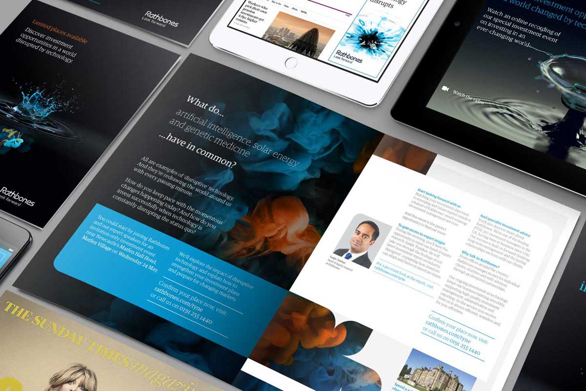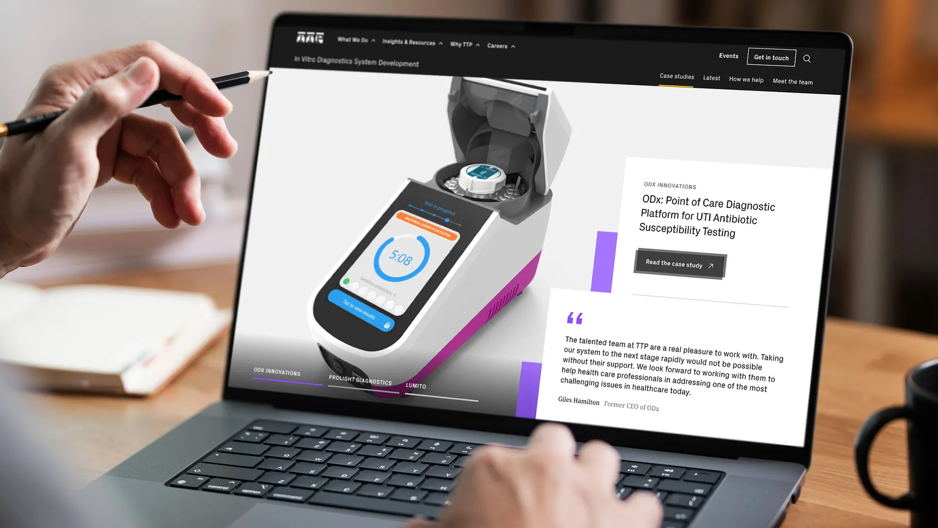
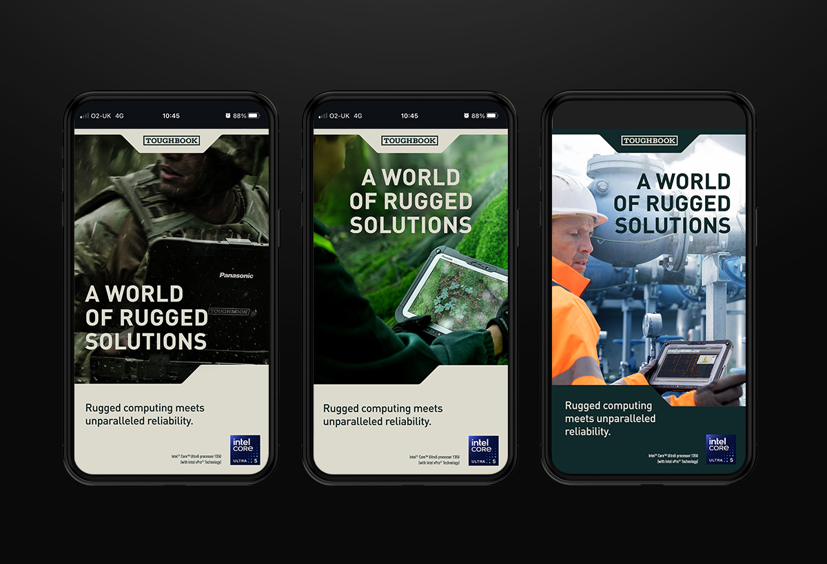


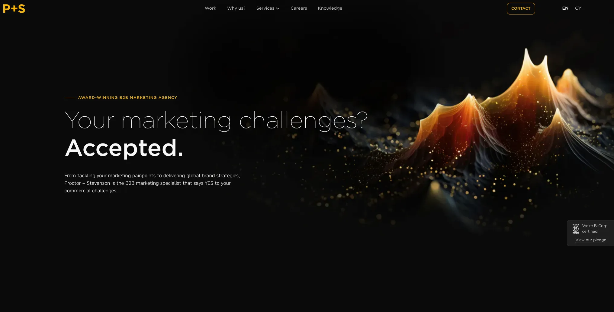
Our imagery has been created to give the brand an instantly recognisable visual presence across every touchpoint.
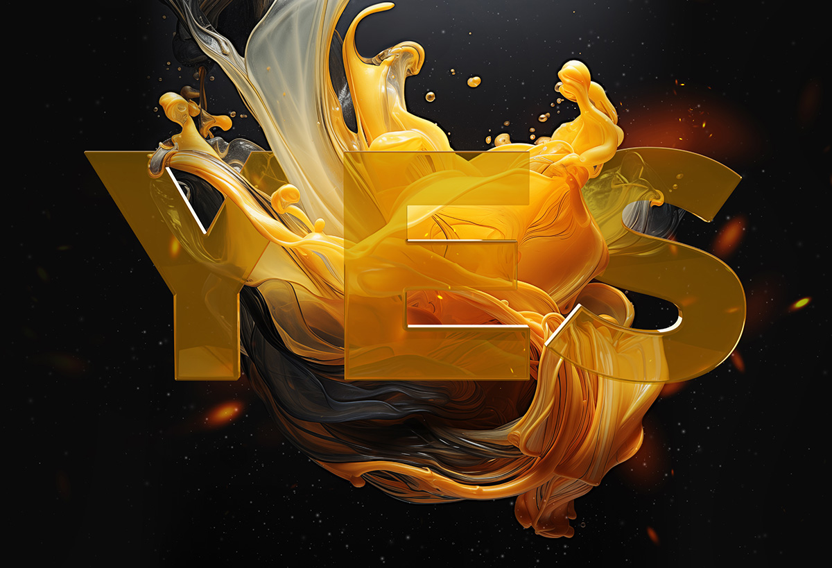
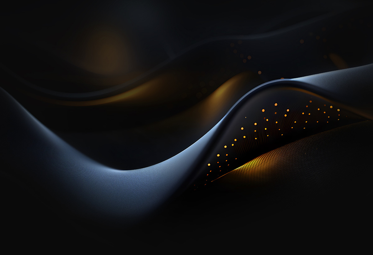
Using a combination of art direction, design skill, digital craft and AI-assisted image creation, we’ve developed a distinctive style built around abstraction, atmosphere and beautiful creativity. Often, they aren’t literal illustrations or conventional photography treatments. They’re visual expressions of the brand itself.
The imagery is designed to feel bold, immersive and unmistakably ownable. Organic forms, flowing structures and layered compositions work together to create a visual language that’s modern and emotionally engaging.
Think of them as being idents for a broadcasting company – they top and tail programmes throughout the day reminding people who they are watching. The individual programs may all vary but the visual glue that sticks it all together remains constant.
Consistency is the key
Consistency is essential to building long-term recognition. Our imagery should always feel part of the same visual family. While individual executions may vary in layout, colour, movement or meaning, the underlying feeling should remain constant.
Avoid literal scene-setting, overly realistic photography treatments or generic stock-style visuals. Instead, focus on abstraction, shape, texture, light and composition. Detail, rhythm and form should take priority over direct representation.
The result should feel crafted rather than decorative. It should be visually striking without becoming chaotic, and expressive without losing clarity.