work
more
info
more
A modern rebrand for one of the UK's leading machinery parts suppliers
HTS Spares is one of the UK’s leading suppliers of machinery parts, serving customers across agriculture, construction, and industrial sectors. As the business grew, its visual identity and messaging had become fragmented across sub-brands, each with their own distinct look and feel. HTS recognised the need to unite everything under one clear, modern and cohesive brand that would strengthen recognition, trust, and scalability for the future.

HTS needed to modernise and unify its brand while maintaining the heritage and reliability that had made it successful. The brief was comprehensive:
- Conduct a brand audit to understand the current positioning, strengths, weaknesses, and opportunities across HTS Spares and its sub-brands.
- Create a refreshed brand identity that felt bold, clean, and modern – aligned to HTS’s reputation for reliability and innovation.
- Develop a sub-brand strategy that would clearly connect each offering back to the parent brand, while allowing distinct identities to shine.
- Establish a brand architecture flexible enough to support future growth and diversification.
- Define brand messaging that captured HTS’s essence, proposition, narrative and values– articulating the business as a trusted partner, not just a supplier.
- Deliver an implementation plan to roll the brand out consistently across digital, print, and internal channels.
We began with a full brand audit, exploring every touchpoint to understand how HTS and its sub-brands were currently perceived. This informed the foundation for amore unified, confident and scalable brand system.
Identity
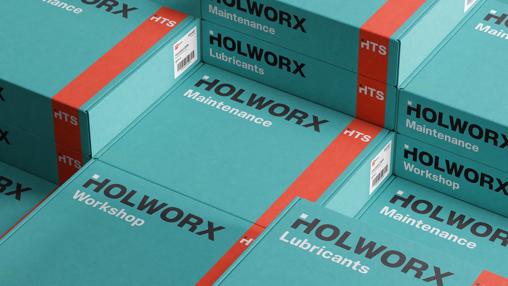
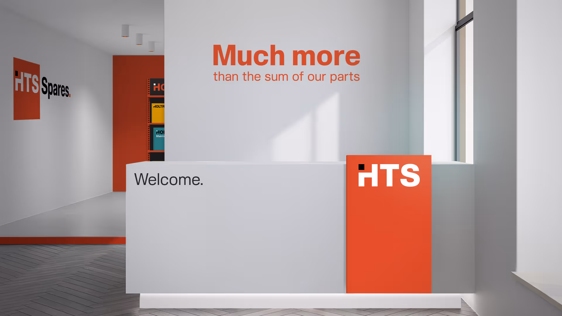
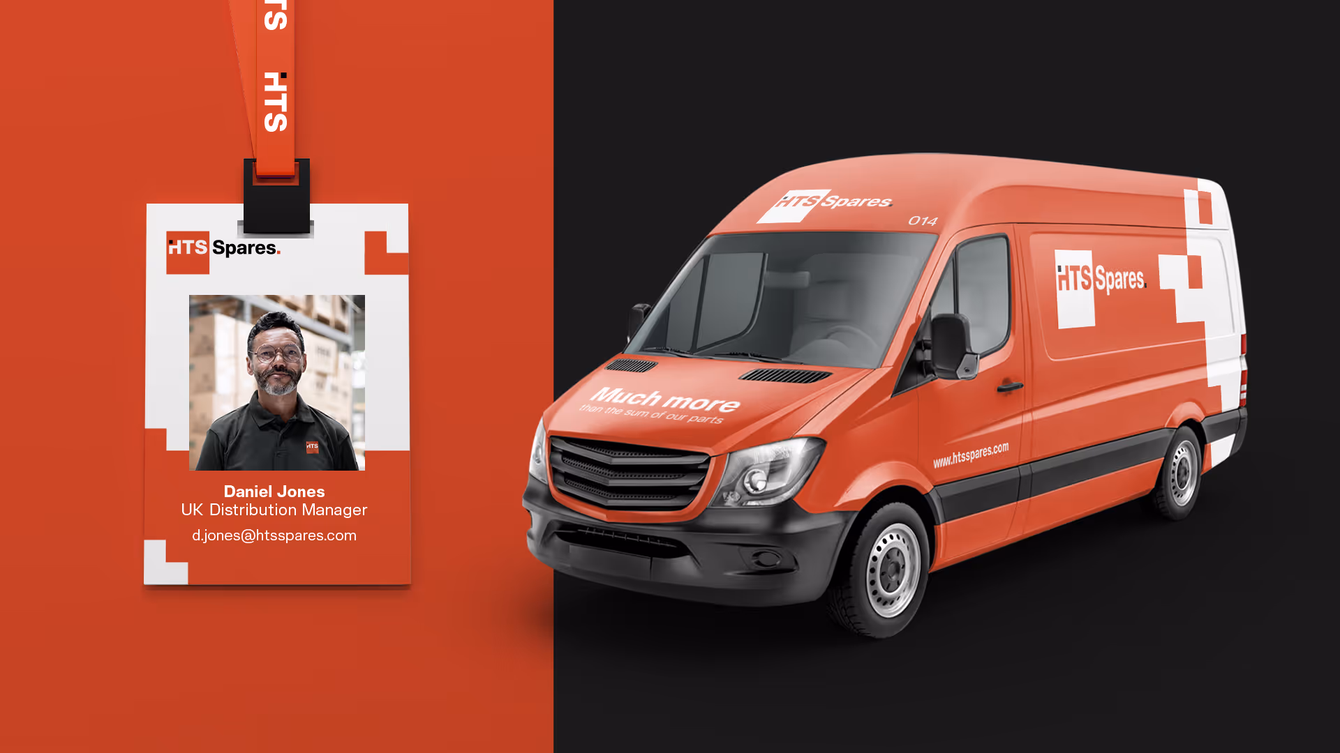
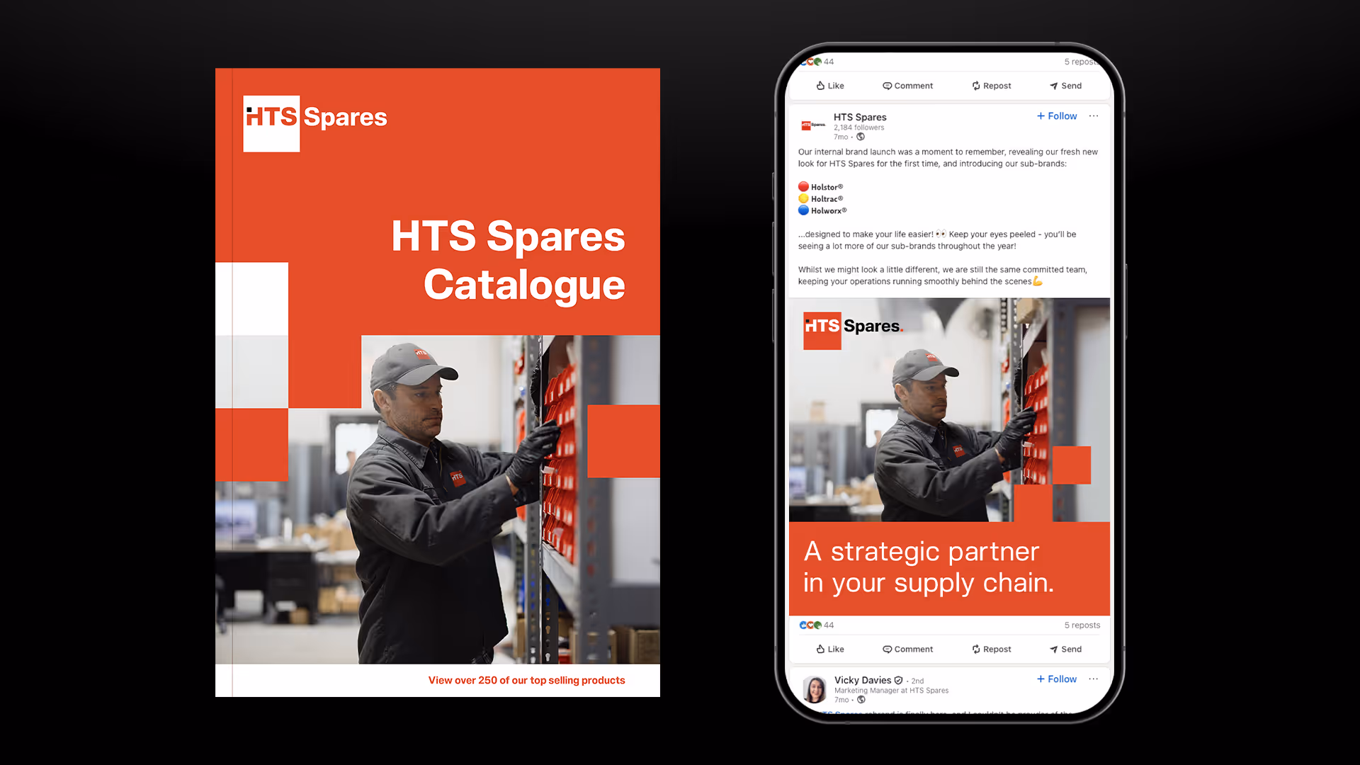
The new identity brought clarity and strength. We developed a bold, clean logo mark, with a subtle but distinctive design cue – a missing element in the first letter, symbolising a spare part. This visual idea became the unifying device across the entire brand family.
We then created a systemised alphabet, allowing the concept to be extended easily to any future sub-brand. Each could be differentiated by its own colour palette while remaining recognisably part of the HTS family.
The overall visual approach was modern and minimal, supported by strong, industrial-inspired typography and a refined colour palette that conveyed professionalism and confidence.
To show the identity in action, we provided a comprehensive range of templates and concepts, from digital applications to packaging. The packaging designs were intentionally simple and bold, ensuring visibility and consistency across warehouse environments.
Brand Messaging
HTS Spares does far more than supply components. They are a strategic partner, helping customers set new standards in fleet optimisation, uptime, and productivity. Their expertise and service drive smarter operations and long-term relationships – improving businesses, not just machines.
We worked closely with the HTS team to define this message and capture the brand’s true character. Together, we developed the brand proposition, essence, narrative, and values, grounded in what truly defines HTS: honesty, hard work, problem-solving and doing the right thing for their customers.
The result was a cohesive, future-proof brand built on clarity, confidence, and credibility. HTS now has a unified visual and verbal identity that positions them as a market leader and trusted partner, with a framework flexible enough to support continued growth and diversification.